Il design di Harry Potter
Creative Review ha intervistato Miraphora Mina e Eduardo Lima, lo studio di design che ha lavorato alla creazione del merchandise e della grafica degli elementi scenici presenti negli adattamenti cinematografici dei romanzi di Harry Potter.
The range of design styles on display is impressive and captures the films' combination of humour, horror and fantasy.
On one wall, packaging and adverts for products in a shop owned by the Weasley family combine early 20th century print advertising with humorous taglines and garish colours, while posters promoting the fictional game of Quidditch (below) reference 1950s Olympics adverts.
Official notices and letters use hand written fonts, and pamphlets demonising 'mudbloods' — a wizard born to non-wizard parents — are inspired by Soviet progaganda (top).
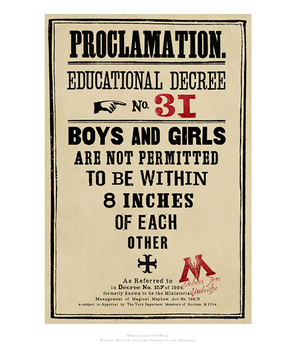
"One of the best things about working on the Harry Potter films was being able to try out so many different styles, from Victorian letterpress to modern design," says Lima.
"The Daily Prophet was designed to look very Gothic, as did the architecture of Hogwarts [the boarding school for wizards where the film is set]. When an organisation called the Ministry of Magic takes control in later films, the school becomes a kind of totalitarian state, so we started looking to Russian constructivist design to reflect that," says Mina.
